
Korebami Adebajo, a Ph.D. candidate in Mechanical Engineering, and Ertan Ağaoğlu and
Mehrnoush Mokhtarnejad, both students in the College of Information and Communications,
are the winners of this year’s University Libraries Graduate Student Data Visualization
Awards.
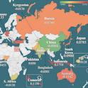
Ertan Ağaoğlu, a Ph.D. Candidate in Mass Communications, was recognized for his exploration
of “The Global Gender Gap in AI Knowledge and Its Consequences,” which he maps out
by age, gender and region.

Korebami Adebajo was honored for her project “Digital Twin Optimization for Battery
Degradation in Electric Aircraft,” which uses several data visualization methods to
facilitate understanding of a variety of different possible outcomes as airplane batteries
degrade during flight.
Mehrnoush Mokhtarnejad, a Ph.D. candidate in Library and Information Science, earned
the award for “Mapping America’s Energy Footprint, Household Consumption and Costs
by State, 2020,” which uses advanced data visualization techniques to analyze residential
energy consumption disparities across U.S. States.
First launched in 2023, the Data Visualization Awards were created to highlight innovative
research by USC graduate students, celebrate excellence in using data visualization
to enhance knowledge explanation and comprehension, and promote data literacy and
effective data visualization creation and presentation.
This year’s submissions spotlighted an increasingly diverse and dynamic use of data
visualization techniques by graduate students across multiple disciplines, says University
Libraries Data Visualization Librarian Glenn Bunton.
“Variety was once again the spice of this year’s competition,” Bunton noted. “We received
entries from five different colleges on topics ranging from the environmental pressures
on bluefin tuna populations to the impact of cellphone use on attention to pollical
information to variations of internal standard refrigerator temperatures and more.”
The winners’ work also spotlights the wide range of data visualization techniques
that are available and the various ways these techniques can facilitate reporting
on research findings, Bunton says: “Mr. Ağaoğlu’s entry displayed highly effective
use of different data visualization types to convey an interesting and timely data-driven
story. Ms. Mokhtarnejad’s entry shows how one can combine relatively simple bar charts
with more complex heatmaps, symbol maps, and scatterplots to convey important information
in a clear and meaningful way. And Ms. Adebajo’s submission shows, among other things,
how one take data visualizations created for a published research article and combine
them into an informative and intriguing data visualization-based infographic.”
University Libraries offers data visualization support through its data services program, which assists USC faculty and students with technology needs in all stages
of the research process. Other digital research services include research data management,
AI/data science support and scholarly communications.
